Website Overhaul for Content Prioritization and User Experience
Redesigning a website to align with stakeholder goals and user needs.
Sector: Federal
Challenge: Our team was tasked with improving the user experience and migrating the Office of Cancer Centers website to a new platform with a limited budget and strict deadline. The website needed to be improved to allow users to more easily access relevant information and to fit within the design system of the new platform.
My Role: Content Strategy, Web Content Manager, Migration, Content Type Creation.
Stakeholder Goals and Scope Discussions
The first step of our process was outline our scope and to get a better understanding of stakeholder goals and priorities. Due to the budget restrictions, we would only be able to redesign the most important pages and would have to migrate the rest and only adjust them to fit within the new design system.
As a result of our discussion, we found that the design of the homepage, user access to information about the Cancer Centers, and a clear user journey to various resources were the most important facets of this revamp.
Findings and Proposed Solutions
After conducting a review of the content, our team determined that:
- The entry point (homepage) was being underutilized as a way of directing users to the appropriate content.
- The search functionality for Cancer Centers were confusing and difficult to navigate, in part because it spanned multiple pages.
- The Cancer Centers directory was messing up the user flow by directing people away from the site through external links. There was also information about each center on various pages.
Our team proposed the following solutions to implement:
- Redesign the homepage in a way that makes navigation easy and clearly defines content.
- Redesign the Cancer Centers Directory into one usable page.
- Create individual Cancer Center pages to keep the user flow on the site and consolidate relevant content in one place.
Results
Homepage
I worked with designers to restructure the content on the homepage to better fit within the confines of a new design system. We highlighted the content prioritized by the stakeholders and created a way that user could better better start their journey through the site.
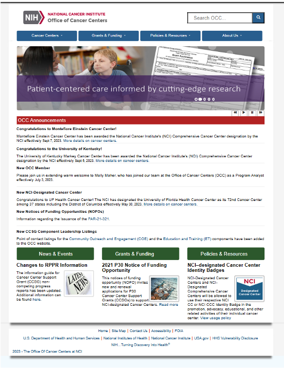
Before: The homepage was visually confusing which made navigating to essential content difficult for the user. It did not showcase the priority content. It also used components that were not a part of the new design system, such as a carousel.
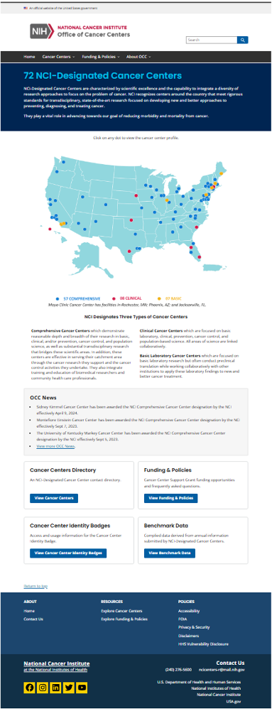
After: The new homepage was adapted to fit into the design system. It better highlights the Cancer Center content and used components and colors to help navigate the user through their user journey.
Cancer Center Directory
We redesigned the search function to be more visually appealing and easy to navigate. This search would in tern lead users to the new individual cancer center pages which would allow them to find all the relevant information in one place, rather than navigating through multiple tables and eventually off the site.
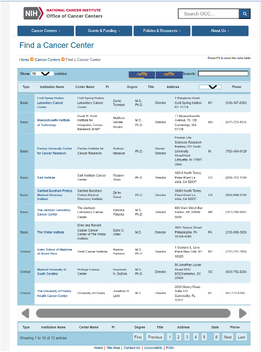
Before: This is an example of one of the multiple pages users had to access in order to find information about the Cancer Centers. This directory was visually and intuitively difficult to navigate.
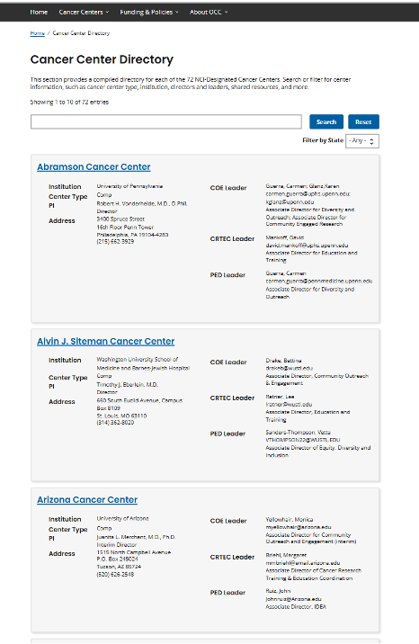
After: This design is more streamlined, visually appealing, and easy to understand for the user. It aligns with the new design system for the site.
Cancer Center Individual Pages
The process of content typing for the individual center pages included creating content worksheets, collaborating with UX designers to prototype the layout, working with developers to implement the changes and adjust as needed, and migrating the mass amounts of content into the content management system (CMS).
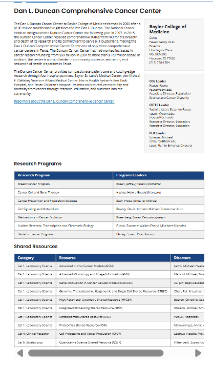
This was a new content type that we created to consolidate the content that was found on numerous internal and external pages. Previously, a user would have to navigate externally and interrupt the user flow within the site to find the same vital information. In this example, we used the elements of the design systems to breakout priority content and make it easier for the user to digest.
